Thursday, January 27, 2011

PEPSI!

This is my 3D interpretation of the lifeblood of the universe.


Dedicated to my mom and brother who love Pepsi even more than I do!

Reference Patterns

These are various image patterns that I collected from a Google image search for "building windows." I chose to go with lighter colors since it matched the buildings in the original reference image of the scene. Originally I was going to just cut up the reference image and UV map that to my objects but it looked silly. I figured most building windows look basically the same anyways so I found something close. The only difference is that my reference shot was taken during sunset or something with low light and the images I found on Google had daytime lighting. Overall, I feel like I did a good job picking out textures which helped build the mood and feel for my buildings.

These two were used mostly for the round buildings:


These were used for most everything else:

Tuesday, January 25, 2011

City with Skin


This is that city I was working on. I put some textures on it. I think it looks good. :)

Thursday, January 20, 2011

Late Work (Project 2)

I was a little confused about what i was doing at first but here is my unskinned version of one of those cityscapes.

Monday, January 17, 2011

Reflective Essay 2: Cityscapes

Cityscape Dusk Rainier (5)
http://www.danheller.com/images/UnitedStates/Washington/Seattle/Cityscapes/Nite/Slideshow/img5.html


Metropolis - Vancouver, Canada
Massimo Strazzeri
http://www.massimostrazzeri.com/Cityscapes.html


Streets of Ayala Ave
Edwin Martinez
http://farm3.static.flickr.com/2065/2207495507_fd23142055_o.jpg
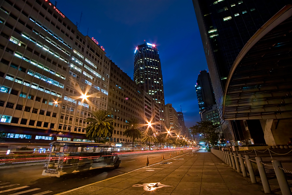

All three of these images have different viewpoints. One is straight with the horizon, the second is more of a birds eye and the third is from worms eye. All were shot during the evening or early morning time where there are lots of lights but there is still some soft daylight so that the viewer can still see the faces of the buildings and not just silhouettes. They all look like long exposures and most notable in the last image. all maintain the idea of the cityscape with nice big buildings up front fading into smaller buildings in the distance.


They all have a lot of depth and noticeable foreground/background/mid-ground relations.
In the first image the focus is on the mid-ground. There are a few smaller more detailed buildings in the foreground but the are shadowed by the magnificent size of the buildings in the mid-ground. The background does show a MT. Rainier in the back which is a huge mountain but compared to the buildings its tiny. The second image also focuses on the mid-ground but there is a huge building in the foreground that catches your eye the first time you look a tthe image.
The third image also focuses on mid-ground. There is some kind of vehicle in the road in the foreground and some kind of fence but using the long exposure leaves the car transparent so most of the focus remains in the foreground.

As for size contrast, there is lots of difference in the sizes of the buldinds and the main focus of these images are of the monumental buildings that put the rest of the city in its shadow. I mean, you can see cars and such but the main focus is on the buildings. The image that has the most size and detpth contrast, I think, is the third image. I dont know if it was a wide angle lense or what but you get a real sence of depth. At first you can see chains, even road cones but then you get this gigantic building in the midground that isn't as detiled as the cones but can only be appriciated for its grander design as a building as a whiole.

For contrast , theses all show good contrast due to the time of day they were shot at but the black and white image, being black and white is the most noticeable. You can really see how certain highlights and shadows in the composition really interact with each other to create separation and depth. With the skyscraper in the foreground you can see a bright line on the very edge of the left face which makes it pop-out from the buildings in the background. This same highlight is echoed on other buildings into the background; keeping the picture from looking like a mass of shadowy blocks and allowing them to each hold their own form.

The last two images I think are framed very well and hold the viewers attention on the cityscape as a whole. However, I find the first image looks like it should have been taken a little more of the left or cropped to the right. My eyes just get pulled into the detail of the dome with its rhythmic structure and curved shape that highly contrast with the blockiness of the rest of the buildings in the image. My eyes just get pulled there and they want to see more of the detail of that building but can't because the image is pretty much in the background.

PS. I noticed that the images got croped when I posted them, so to see what I'm talking about just click on them. ...I don't want to go through the hassle of resizing. :)

Reflective Essay Week 1 (Jan 11)

After reading the FNV interview, the idea that most stuck out to me was the planning. At one part in the interview they described the process of how they took ideas and drew up the concept art before giving it out the the designers. So when I was picking my reference images, I began mentally planning my scenes out. What buildings do i think i could do, and how am I going to go about doing it and such?

So my plan was to just find the images and reproduce them best I could. I learned a lot through the process 'cause in dealing with angles that were hard to reproduce. But I learned that I could "cheat" mess with angles and distant objects perspectives to create the proper illusions.

The image that I think turned out the best was the bridge. Just because I think its easier to tell that its a bridge. After the rendering a lot of the shadows were way different since I don't know any lighting yet. By far the image is not finished, I was just poking around with the image and I thought that it was finished enough to demonstrate my skills. After all, that was after only a few days playing with Maya.

I think I could have done better with the original images I found. I was just looking for something grand so I found pyramids and bridges but I think something like the inside of a cathedral would have been a better starting point. Its amazing to think how monumental objects like the pyramids are in real life, but when you put them in 3d its just some basic objects that looks too simple. I found that the pyramid shapes are a little harder to manipulate to cause that old deteriorating look since the way you edit the angles is more like a Christmas tree than the thousands of blocks their made of. So far I'm having fun with the program so I guess I'll learn.

Tuesday, January 11, 2011

My Maya Compositions

These are 3 images that I reproduced using Maya.

Bridge


Water Tower


Pyramids


Some of the shading is off 'cause i didn't use any lighting but I don't think its bad for my first run. :)

Thursday, January 6, 2011

Project 1: Reference Material

Here are ten images that I looked up on the internet today to use as reference material for my first project.

Milan's Duomo
by: Nicholas
http://wizardineurope.blogspot.com/2009/06/milans-duomo.html


Bridge II
Based on photo by melastmohican
http://art4linux.org/node/434


The Water Tower
http://www.bootscooters.com/13%20Goldfield%20water%20tower.htm


Old Western Town
by: stagewestphotography
http://www.eyefetch.com/image.aspx?ID=439772


Piranesi Drawings
http://diparchpaddy.blogspot.com/


Pyramids of Giza
Photo by: wikipedia, Creative Commons
http://famouswonders.com/great-pyramids-of-giza/


Great sphinx
http://www.mydesktopwallpapers.info/good%20wallpapers/slides/Great%20Sphinx,%20Chephren%20Pyramid,%20Giza,%20Egypt.html


Pyramids of Giza
Submitted by Edward Roberts Jr. on April 15, 2009
http://www.globetourguide.com/2009/04/pyramids-of-giza-of-egypt.html


India travel picture - Bahai Lotus temple, New Delhi,
by FreeBirD
http://www.travelindiapictures.net/India_travel_picture_bahai_lotus_temple_new_delhi.htm


Sydney Opera House
Photo of Sydney Opera House at night by Anthony Winning from Harbour Bridge. Taken 26 Dec, 2005.
commons.wikimedia.org