YouTube is by far one of the most popular video sharing sites on the internet. Recently the company announced that they have reached over two billion videos viewed per day. That seems almost impossible! People are using it for news, entertainment, education, dreams of fame, and for speaking their minds. I personally have it set as my home page on my browser and there is almost never a day that goes by that I don't use it. It's just that videos seem much more entertaining and straight forward. This is probably due to the fact people can just sit back and relax as the videos play themselves at a steady pace, compared to text or images which people read at their own pace. Then there is also just the wow factor of being able to see almost anything you want, except for porn. I mean you can still find chicks shaking it on YouTube but basically they try to keep that stuff off their site. This is a good thing, because most other video sharing sites that allow porn usually just turn into porn sites.
Another great innovations that YouTube has created for their video sharing experience is the ability to embed links within videos. Most of the time the links just take you to someone's channel or something but some people are actually using the linking to create a 'choose your own adventure' type interactive video story. People started doing this as soon as the ability to embed links in their videos started. Recently though, the production value on these adventures has begun to go up and we are now seeing much more polished works of art.
I had the luck of stumbling across a piece entitled Interactive Movie Zombie Adventure which was made to promote a company called Hell's Pizza. I must say, this is by far one of the best interactive videos I've seen yet. Throughout the video the user gets to make about three decisions (more if you make the wrong decisions like I did) that either end the story or keep it going. However the thing that really got me was the the quality of the production. The whole thing was in HD, the actors were pretty hilarious, costuming seemed legitimate, and the story line was nicely written. At one point there was a little skit concerning a scooter that can only be described as ROFL.
This is the kind of artwork that I like the best. Artwork that uses the newest and hippest technology to infiltrate an audience. Ten years ago, even five years ago, this would not have been possible. We needed to wait till peoples internet connections were fast enough, until the website supported HD, and until a non pornographic video site took over the internet. And still with all that we needed crafty individuals to come up with a way to use technologies in alternative ways. Admittedly though YouTube is so big now that many people will never find this video amongst the endless sea of other videos that are constantly growing ever day. I still think its cool though how people can figure out how to take something as passive as watching a video on the internet and make it into an interactive artwork by simply using the tools that we take for granted everyday. Happy YouTubing.
Monday, November 14, 2011
Tuesday, November 8, 2011
Capstone
Artistic Goals
I plan on creating an immerse 3D space in which live webcam feed is assigned to finite user controlled 3D "points" within that space. Users would then be able to move thier "points" freely within the 3D space. The viewer can choose to navigate to and observe the webcam feed on other "points" or a they could simply sit back and watch the interactions between the various "points" navigating within the 3D space.
Technical Tools
- Generate a 3D space using jit.gl.
-Generate 3D points with jit.gl
-Webcam Integration onto 3D objects.
-User control via mouse or keyboard.
-Support for multiple user.
Timeline
Week 1
-Decide on the 3D space to work in. [1hr]
-Code camera view controls to mouse and keyboard. [2hrs]
-Decide the best way to display the controllable points (g. on boids or on 3D shapes?) [1hr]
-Research the best way to pull webcam feed off the internet and figure out the limitations. [2hrs]
-Assign a webcam to the camera view/3D shape. [1hr]
-Troubleshoot [5 hrs]
Week 2
-Make demo program [2hrs]
-Load it to another computer [1hr]
-Integrate a second webcam [2hrs]
-Troubleshoot [5hrs]
-Integrate more webcams [2hrs]
-Troubleshoot [5hrs]
Week 3
-Work on proximity interactions
-Sound [2hrs] Video [2hrs]
-Work on other visual interactions [4hrs]
-Troubleshoot [5hrs]
Week 4
Final Touches
Monday, October 24, 2011
Interactive Art
In his 2004 article entitled Trouble at the Interface, or the Identity Crisis of Interactive Art, Erkki Huhtamo tries to define the crazily progressive world of interactive art. He goes over his first encounter with interactive art at the Prix Arts Electronica and how he has been obsessing over it ever since. Huhtamo even drops some important history about the beginnings of interactive art, starting with the Futurist, and Dadaist movements of the past. Actually he drops a lot of history about interactive art; how it was influenced by the industrial era, invention of the computer, toys, and even vending machines. Overall, Huhtamo seems like hes pretty ecstatic for interactive art. Or is he...
In 2004 Huhtamo returned to his happy place, the Prix Arts Electronica. But this time, to his dismay, he is awestruck to find that an artwork which he considered non-interactive, winning the Grand Prize in "Interactive Art." The piece was entitled Listening Post and was created by artist Mark Hansen. Basically it uses a computer to pull random text from various internet chat rooms, arranging them one word at a time onto a display consisting of hundreds of little LCD screens. Many audience members described the experience as meditative. Huhtamo's didn't see it the same way.
Huhtamo went into a whole long explanation about why the piece won but didn't deserve to win. First he looks at the Jury's perspective and finds that they have shifted their perspective and altered the definition of "interactive art" to include: 1. Computers as non-required, 2. The idea of "real-time" was relaxed and 3. passive interaction as allowed. Hutamo's response was -just make a whole new category of art already.
However, out of his frustration with the Listening Post , he does point out a lot of other interactive artworks that share things in common with the newly added rules. Like the fact that interactive art started before computers. But he still points out that its not interactive and is more like a painting in the sense that you just sense it and nothing more. Oh, and he doesn't like the idea about incorporating the internet either. Something about cybernetic organisms... and um John Connor? Might of just threw that in, anyways... Huhtamo finishes his argument with the statement that we should make a new category for things like the Listening Post that aren't up to his standards of interactivity.
So after reading that, I looked at some a couple of other Grand Prize winners for interactivity at the Prix Ars Electronica. First I looked at The Fulgurator which is this cool camera-gun thing that this guy Julius von Bismark made. It uses the cameras flash to flash words or images that are captured on film but too fast to be seen by the naked eye. It leaves a cool little image in "real-time."
 The second artwork I looked at was called the EyeWriter and its a cool little mod this team of guys made out of existing technology. It allows artist who are paralyzed to draw with their eyes. The Eyewriter is pretty amazing. After watching the little video they made to demonstrate the technology, I was inspired. I mean, art is all about being able to express yourself. Developing something that allows someone to do that, especially for someone who thought they would probably never be able to express themselves ever again, is simply amazing.
All in all, I don't see what Huhtamo is so worked up about. Interactive art is part of art which is defined by its ability to incorporate new ways of interactivity. In this era of high technology, it is no surprise that innovations in the field are going to happen fast. And not all of those innovations are going to fit nicely into the previously constructed category. I think the problem comes with trying to define any aspect of this realm of infinite potential and creativity known as art. Especially when you start to break things into categories such as "interactive." After all, anything that is art has to incorporate some level of interactivity, even if its just through your eyes, which can do much more than just look at things, as proven with the EyeWriter. I say we take some pointers from the some of the original curators of this type of art-form, like the Dadaist, and stop trying to define all our parameters.
In 2004 Huhtamo returned to his happy place, the Prix Arts Electronica. But this time, to his dismay, he is awestruck to find that an artwork which he considered non-interactive, winning the Grand Prize in "Interactive Art." The piece was entitled Listening Post and was created by artist Mark Hansen. Basically it uses a computer to pull random text from various internet chat rooms, arranging them one word at a time onto a display consisting of hundreds of little LCD screens. Many audience members described the experience as meditative. Huhtamo's didn't see it the same way.
Huhtamo went into a whole long explanation about why the piece won but didn't deserve to win. First he looks at the Jury's perspective and finds that they have shifted their perspective and altered the definition of "interactive art" to include: 1. Computers as non-required, 2. The idea of "real-time" was relaxed and 3. passive interaction as allowed. Hutamo's response was -just make a whole new category of art already.
However, out of his frustration with the Listening Post , he does point out a lot of other interactive artworks that share things in common with the newly added rules. Like the fact that interactive art started before computers. But he still points out that its not interactive and is more like a painting in the sense that you just sense it and nothing more. Oh, and he doesn't like the idea about incorporating the internet either. Something about cybernetic organisms... and um John Connor? Might of just threw that in, anyways... Huhtamo finishes his argument with the statement that we should make a new category for things like the Listening Post that aren't up to his standards of interactivity.
So after reading that, I looked at some a couple of other Grand Prize winners for interactivity at the Prix Ars Electronica. First I looked at The Fulgurator which is this cool camera-gun thing that this guy Julius von Bismark made. It uses the cameras flash to flash words or images that are captured on film but too fast to be seen by the naked eye. It leaves a cool little image in "real-time."
The second artwork I looked at was called the EyeWriter and its a cool little mod this team of guys made out of existing technology. It allows artist who are paralyzed to draw with their eyes. The Eyewriter is pretty amazing. After watching the little video they made to demonstrate the technology, I was inspired. I mean, art is all about being able to express yourself. Developing something that allows someone to do that, especially for someone who thought they would probably never be able to express themselves ever again, is simply amazing.All in all, I don't see what Huhtamo is so worked up about. Interactive art is part of art which is defined by its ability to incorporate new ways of interactivity. In this era of high technology, it is no surprise that innovations in the field are going to happen fast. And not all of those innovations are going to fit nicely into the previously constructed category. I think the problem comes with trying to define any aspect of this realm of infinite potential and creativity known as art. Especially when you start to break things into categories such as "interactive." After all, anything that is art has to incorporate some level of interactivity, even if its just through your eyes, which can do much more than just look at things, as proven with the EyeWriter. I say we take some pointers from the some of the original curators of this type of art-form, like the Dadaist, and stop trying to define all our parameters.
Monday, October 3, 2011
Homework...
I read Jim Campbell's Delusion in Dialog and he talked about how people don't understand computers. Then he gave me a confusing riddle about how we interact with ourselves by interacting with the computer. He also said programs like photoshop suck 'cause they don't let the user do anything. That it's better to use third party software but you don't want to get stuck on that either. I got no new way of understanding how to talk about art on computers other than saying computers can do math functions like; simulate randomness, get input and remember stuff. We are suppose to describe stuff as functions like; activating a hidden button to cause "seeming" intelligence or something.
So I looked at this guy Prix Ars and he made what he calls a Gambiocycle which is just a fancy name he gave to his rig that he built upon his bicycle, making it "portable." It pretty much consist of a bunch of input devices rigged to a computer with a projected output. This allow for real time interaction between viewers and the artwork.
So what I got out of the reading is that we need to input into a computer and get an output since the computer is just numbers and doesn't do any real thinking. I think Campbell's framework should be extended to analyze the way the art is being output. To me the most important piece of technology is not the computer but the projector. Sure the computer is running all these processes but the real draw to the work and what makes it interactive is that it is being projected onto a huge visual screen. The fact that its now apart of the environment means that anyone can enjoy it from their own unique perspective. It also allows the audience to feel connected in an experience without being constrained to the experience. Like when you go to a club you don't go to listen to music but the music is a necessity.
Sunday, June 5, 2011
Branigan's Art Experiment
From the beginning, all I was trying to do was something original in the hopes that it would help me live a better life. So I started out with an idea I thought was impossible: Animating without having to change the image, just changing the filter or perspective. This drew its inspiration out of Rufus Seder’s “Scanimation.” I wanted to construct some sort of stationary display that would change when the viewer walked past it. I had some prototypes:
 But through more and more research, found out Seder already had it covered.
  Originality Fail!
I tried to be more original (like 10x) and figured there should be a way to simply design a flat image that would work somehow. Kind of how auto-stereograms, optical illusions, or holographic images work.
Ended up with stuff like this:

 Then I heard a few people in class talking about online art contest and monies and I got distracted. Idea: use one of the unique display styles I’ve been working on in an online contest. Woot! BTW here’s a good site for online contest.
However, at this point I began to get frustrated and tripped out with all the weird angles and patterns of everything I’d been doing.

 (I used all the different colors so that I could easily select the different sections alternatively by color to compile my images.)
I thought maybe I was being too technical and needed to be more emotional or something. Awww.
Anyways… made this pretty picture:
 Originally meant for the ladies ;) I entered it into a condom design contest, so I guess now it’s for men... As you can probably tell, I incorporated some of the line style from the scanimation into it. I think it looks pretty good on a rubber and the catch phrases I thought up go with it pretty well. Condom companies name is “One” BTW.


I know your suppose to let the audience interpret the emotional message of the artwork but I interpret it as my longing to return home to Hawaii this summer and spend a nice time on the beach with those who are closest to me. Fueled by emotional intent, I decided to enter more art contest in hopes to make the monies to do that! The next contest was to make a commercial for 3M following a theme dealing with "couple speak". So I made one in flash. Took me 2 days or around 10 hours. I rushed it ‘cause there was an extra $1,000 that could be made if you got it in on June 1st by 4:00 pm. I got it in that day at 3:59pm :P Here it is.
In conclusion, I learned a lot through being both technical and incorporating emotions. Now I have some motivation through online art contest to get my work at least seen.
 But through more and more research, found out Seder already had it covered. Originality Fail!
I tried to be more original (like 10x) and figured there should be a way to simply design a flat image that would work somehow. Kind of how auto-stereograms, optical illusions, or holographic images work.

Ended up with stuff like this:

 Then I heard a few people in class talking about online art contest and monies and I got distracted. Idea: use one of the unique display styles I’ve been working on in an online contest. Woot! BTW here’s a good site for online contest.
However, at this point I began to get frustrated and tripped out with all the weird angles and patterns of everything I’d been doing.

 (I used all the different colors so that I could easily select the different sections alternatively by color to compile my images.)
I thought maybe I was being too technical and needed to be more emotional or something. Awww.
Anyways… made this pretty picture:
 Originally meant for the ladies ;) I entered it into a condom design contest, so I guess now it’s for men... As you can probably tell, I incorporated some of the line style from the scanimation into it. I think it looks pretty good on a rubber and the catch phrases I thought up go with it pretty well. Condom companies name is “One” BTW.
I know your suppose to let the audience interpret the emotional message of the artwork but I interpret it as my longing to return home to Hawaii this summer and spend a nice time on the beach with those who are closest to me. Fueled by emotional intent, I decided to enter more art contest in hopes to make the monies to do that! The next contest was to make a commercial for 3M following a theme dealing with "couple speak". So I made one in flash. Took me 2 days or around 10 hours. I rushed it ‘cause there was an extra $1,000 that could be made if you got it in on June 1st by 4:00 pm. I got it in that day at 3:59pm :P Here it is.
In conclusion, I learned a lot through being both technical and incorporating emotions. Now I have some motivation through online art contest to get my work at least seen.
Thursday, June 2, 2011
Sunday, May 29, 2011

Saturday, May 28, 2011

Thursday, May 26, 2011


Tuesday, April 26, 2011
Get Off My Graph!!!!
Good Lt. Dan vs. Evil Lt. Dan (OMG! who's who?)
If you fall off the graph in the Maya, do you fall off the graph in real life?...
If you fall off the graph in the Maya, do you fall off the graph in real life?...
Thursday, April 21, 2011
Lt. Dan Walk/Run/Ninja
Here are some 3D animations I made with the Lt. Dan rig.
Walk Cycle:
Run Cycle:
Ninja Trick:
Walk Cycle:
Run Cycle:
Ninja Trick:
Thursday, April 14, 2011
Lt. Dan Jumping Rig
So this is my Lt. Dan jumping. Its a little slow in this render for some reason. In Maya I was working on 24 fps thinking it was 30fps. I easily changed that to 30fps and it looked good and fast. But when I rendered in quicktime I had to put my fps up to 60 and its still slow!!! So yea...
Thursday, April 7, 2011
Some 3D Ball Bouncing
This is a basic ball bounce. No loop sorry.
This is a long-jump demonstrating my use of the ball rig.
This is a long-jump demonstrating my use of the ball rig.
Tuesday, April 5, 2011
Perspective Dependent Animation
The purpose of this project is to figure out dynamic ways of utilizing displays that depend on a viewers shifting perspective to create an animation.
I will create displays that will seem to animate as the viewer changes their perspective in relation to the object. The effect is similar to a lenticular style of animation called Vari Vues. Another similar technique called Scanimation was made famous by inventor, artist, and filmmaker Rufus Butler Seder.
The process would work pretty much the same as Seder’s Scanamation technique. In it, an assembled image consisting of what seems to be a scramble of lines made up of keyframe images would be decoded by lenticular lines. These lines are spaced out in such a way that only one frame of the animation is revealed at a time as the lines pass over the scrambled image.
Instead of passing the lines over the scrambled image, it would be possible to set an image behind stationary lines. The animation would then be created as a viewer moved around the object. One issue with this technique is that you don’t get a lot of frames to work with, only enough for simple animations. With that in mind I figured a good use of this would be to create simple animated signs or posters.
I plan on experimenting with the fundamentals of this animation effect, messing with frame rates, spacing, and other technical requirements. Once that is complete I plan to create various animations that will flow within the allotted frames. The final aim of my project would be to have a collection of images that would animate with the viewers shifting perspective. Hopefully this can be incorporated into something useful like an animated exit sign or something else along those lines.
The products of study that I may hopefully be able to produce during this project consist of technical data, some kind method for animation and the production of keyframe slides. First I would need to figure out how I'm going to make it work. Then I need some sort of display that houses the lenticular lines. Finally I would need to draw slides to be displayed.
Rufus Butler Seder
Scanimation
Technical Issues:
- Frame Rates
- Color Schemes
- Spacing/Layering
- Creating the display area
- Creating Animations
Timeline:
Week 1 – Project Proposal
Week 2 – Determine best technical specifications for animation with this method.
Week 3 – Create Various Animations
Week 4 - Finish working on animations.
Week 5 - Design a visually appealing way of displaying the animation.
Week 6 – Finish up display unit.
Week 7 – Integrate animations into display unit.
Week 8 – Fix all the problems.
Week 9 – Finish Up
Thursday, March 10, 2011


Thursday, February 3, 2011
Lights!
This is what I made in class today. I was experimenting using spotlights, point lights, directional lights, and area lights on some random shapes.


Thursday, January 27, 2011
PEPSI!
This is my 3D interpretation of the lifeblood of the universe.

Dedicated to my mom and brother who love Pepsi even more than I do!

Dedicated to my mom and brother who love Pepsi even more than I do!
Reference Patterns
These are various image patterns that I collected from a Google image search for "building windows." I chose to go with lighter colors since it matched the buildings in the original reference image of the scene. Originally I was going to just cut up the reference image and UV map that to my objects but it looked silly. I figured most building windows look basically the same anyways so I found something close. The only difference is that my reference shot was taken during sunset or something with low light and the images I found on Google had daytime lighting. Overall, I feel like I did a good job picking out textures which helped build the mood and feel for my buildings.
These two were used mostly for the round buildings:


These were used for most everything else:


These two were used mostly for the round buildings:


These were used for most everything else:


Tuesday, January 25, 2011
City with Skin

This is that city I was working on. I put some textures on it. I think it looks good. :)
Thursday, January 20, 2011
Late Work (Project 2)
I was a little confused about what i was doing at first but here is my unskinned version of one of those cityscapes.


Monday, January 17, 2011
Reflective Essay 2: Cityscapes
Cityscape Dusk Rainier (5)
http://www.danheller.com/images/UnitedStates/Washington/Seattle/Cityscapes/Nite/Slideshow/img5.html

Metropolis - Vancouver, Canada
Massimo Strazzeri
http://www.massimostrazzeri.com/Cityscapes.html

Streets of Ayala Ave
Edwin Martinez
http://farm3.static.flickr.com/2065/2207495507_fd23142055_o.jpg
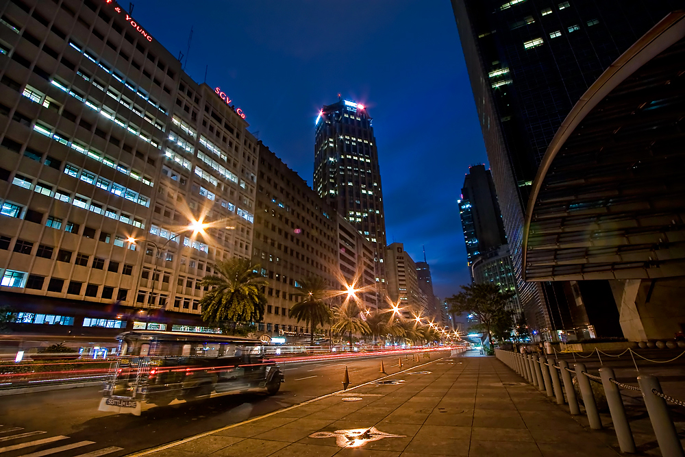
All three of these images have different viewpoints. One is straight with the horizon, the second is more of a birds eye and the third is from worms eye. All were shot during the evening or early morning time where there are lots of lights but there is still some soft daylight so that the viewer can still see the faces of the buildings and not just silhouettes. They all look like long exposures and most notable in the last image. all maintain the idea of the cityscape with nice big buildings up front fading into smaller buildings in the distance.
They all have a lot of depth and noticeable foreground/background/mid-ground relations.
In the first image the focus is on the mid-ground. There are a few smaller more detailed buildings in the foreground but the are shadowed by the magnificent size of the buildings in the mid-ground. The background does show a MT. Rainier in the back which is a huge mountain but compared to the buildings its tiny. The second image also focuses on the mid-ground but there is a huge building in the foreground that catches your eye the first time you look a tthe image.
The third image also focuses on mid-ground. There is some kind of vehicle in the road in the foreground and some kind of fence but using the long exposure leaves the car transparent so most of the focus remains in the foreground.
As for size contrast, there is lots of difference in the sizes of the buldinds and the main focus of these images are of the monumental buildings that put the rest of the city in its shadow. I mean, you can see cars and such but the main focus is on the buildings. The image that has the most size and detpth contrast, I think, is the third image. I dont know if it was a wide angle lense or what but you get a real sence of depth. At first you can see chains, even road cones but then you get this gigantic building in the midground that isn't as detiled as the cones but can only be appriciated for its grander design as a building as a whiole.
For contrast , theses all show good contrast due to the time of day they were shot at but the black and white image, being black and white is the most noticeable. You can really see how certain highlights and shadows in the composition really interact with each other to create separation and depth. With the skyscraper in the foreground you can see a bright line on the very edge of the left face which makes it pop-out from the buildings in the background. This same highlight is echoed on other buildings into the background; keeping the picture from looking like a mass of shadowy blocks and allowing them to each hold their own form.
The last two images I think are framed very well and hold the viewers attention on the cityscape as a whole. However, I find the first image looks like it should have been taken a little more of the left or cropped to the right. My eyes just get pulled into the detail of the dome with its rhythmic structure and curved shape that highly contrast with the blockiness of the rest of the buildings in the image. My eyes just get pulled there and they want to see more of the detail of that building but can't because the image is pretty much in the background.
PS. I noticed that the images got croped when I posted them, so to see what I'm talking about just click on them. ...I don't want to go through the hassle of resizing. :)
http://www.danheller.com/images/UnitedStates/Washington/Seattle/Cityscapes/Nite/Slideshow/img5.html
Metropolis - Vancouver, Canada
Massimo Strazzeri
http://www.massimostrazzeri.com/Cityscapes.html
Streets of Ayala Ave
Edwin Martinez
http://farm3.static.flickr.com/2065/2207495507_fd23142055_o.jpg
All three of these images have different viewpoints. One is straight with the horizon, the second is more of a birds eye and the third is from worms eye. All were shot during the evening or early morning time where there are lots of lights but there is still some soft daylight so that the viewer can still see the faces of the buildings and not just silhouettes. They all look like long exposures and most notable in the last image. all maintain the idea of the cityscape with nice big buildings up front fading into smaller buildings in the distance.
They all have a lot of depth and noticeable foreground/background/mid-ground relations.
In the first image the focus is on the mid-ground. There are a few smaller more detailed buildings in the foreground but the are shadowed by the magnificent size of the buildings in the mid-ground. The background does show a MT. Rainier in the back which is a huge mountain but compared to the buildings its tiny. The second image also focuses on the mid-ground but there is a huge building in the foreground that catches your eye the first time you look a tthe image.
The third image also focuses on mid-ground. There is some kind of vehicle in the road in the foreground and some kind of fence but using the long exposure leaves the car transparent so most of the focus remains in the foreground.
As for size contrast, there is lots of difference in the sizes of the buldinds and the main focus of these images are of the monumental buildings that put the rest of the city in its shadow. I mean, you can see cars and such but the main focus is on the buildings. The image that has the most size and detpth contrast, I think, is the third image. I dont know if it was a wide angle lense or what but you get a real sence of depth. At first you can see chains, even road cones but then you get this gigantic building in the midground that isn't as detiled as the cones but can only be appriciated for its grander design as a building as a whiole.
For contrast , theses all show good contrast due to the time of day they were shot at but the black and white image, being black and white is the most noticeable. You can really see how certain highlights and shadows in the composition really interact with each other to create separation and depth. With the skyscraper in the foreground you can see a bright line on the very edge of the left face which makes it pop-out from the buildings in the background. This same highlight is echoed on other buildings into the background; keeping the picture from looking like a mass of shadowy blocks and allowing them to each hold their own form.
The last two images I think are framed very well and hold the viewers attention on the cityscape as a whole. However, I find the first image looks like it should have been taken a little more of the left or cropped to the right. My eyes just get pulled into the detail of the dome with its rhythmic structure and curved shape that highly contrast with the blockiness of the rest of the buildings in the image. My eyes just get pulled there and they want to see more of the detail of that building but can't because the image is pretty much in the background.
PS. I noticed that the images got croped when I posted them, so to see what I'm talking about just click on them. ...I don't want to go through the hassle of resizing. :)
Reflective Essay Week 1 (Jan 11)
After reading the FNV interview, the idea that most stuck out to me was the planning. At one part in the interview they described the process of how they took ideas and drew up the concept art before giving it out the the designers. So when I was picking my reference images, I began mentally planning my scenes out. What buildings do i think i could do, and how am I going to go about doing it and such?
So my plan was to just find the images and reproduce them best I could. I learned a lot through the process 'cause in dealing with angles that were hard to reproduce. But I learned that I could "cheat" mess with angles and distant objects perspectives to create the proper illusions.
The image that I think turned out the best was the bridge. Just because I think its easier to tell that its a bridge. After the rendering a lot of the shadows were way different since I don't know any lighting yet. By far the image is not finished, I was just poking around with the image and I thought that it was finished enough to demonstrate my skills. After all, that was after only a few days playing with Maya.
I think I could have done better with the original images I found. I was just looking for something grand so I found pyramids and bridges but I think something like the inside of a cathedral would have been a better starting point. Its amazing to think how monumental objects like the pyramids are in real life, but when you put them in 3d its just some basic objects that looks too simple. I found that the pyramid shapes are a little harder to manipulate to cause that old deteriorating look since the way you edit the angles is more like a Christmas tree than the thousands of blocks their made of. So far I'm having fun with the program so I guess I'll learn.
Tuesday, January 11, 2011
My Maya Compositions
These are 3 images that I reproduced using Maya.
Bridge

Water Tower

Pyramids

Some of the shading is off 'cause i didn't use any lighting but I don't think its bad for my first run. :)
Bridge

Water Tower

Pyramids

Some of the shading is off 'cause i didn't use any lighting but I don't think its bad for my first run. :)
Thursday, January 6, 2011
Project 1: Reference Material
Here are ten images that I looked up on the internet today to use as reference material for my first project.
Milan's Duomo
by: Nicholas
http://wizardineurope.blogspot.com/2009/06/milans-duomo.html

Bridge II
Based on photo by melastmohican
http://art4linux.org/node/434

The Water Tower
http://www.bootscooters.com/13%20Goldfield%20water%20tower.htm

Old Western Town
by: stagewestphotography
http://www.eyefetch.com/image.aspx?ID=439772

Piranesi Drawings
http://diparchpaddy.blogspot.com/

Pyramids of Giza
Photo by: wikipedia, Creative Commons
http://famouswonders.com/great-pyramids-of-giza/

Great sphinx
http://www.mydesktopwallpapers.info/good%20wallpapers/slides/Great%20Sphinx,%20Chephren%20Pyramid,%20Giza,%20Egypt.html

Pyramids of Giza
Submitted by Edward Roberts Jr. on April 15, 2009
http://www.globetourguide.com/2009/04/pyramids-of-giza-of-egypt.html

India travel picture - Bahai Lotus temple, New Delhi,
by FreeBirD
http://www.travelindiapictures.net/India_travel_picture_bahai_lotus_temple_new_delhi.htm

Sydney Opera House
Photo of Sydney Opera House at night by Anthony Winning from Harbour Bridge. Taken 26 Dec, 2005.
commons.wikimedia.org

Subscribe to:
Posts (Atom)
